Scaling a Hockey-First Platform into a Multi-Sport Management System
Role:
Senior Product Designer
Context:
B2B SaaS • League Management
Period:
2022 – 2026

SportNinja platform, 2026
Responsibilities
Led navigation and IA redesign, from flat structure to role based hierarchy
Built SportNinja’s design system from scratch: tokens, components, and multi platform libraries
Owned end to end product design across web and mobile, as the platform’s first and only designer
Diagnosed product debt using Firebase and GA audits, plus a 2,500+ user NPS survey
Redesigned the Registration flow, unlocking new subscription tier revenue
Directed SportNinja’s brand refresh: color, typography, iconography, motion
Established design and engineering workflow: component libraries, Dev Mode handoff, weekly Consistency Calls
Led the shift from a hockey only, ad supported app to a 4 tier subscription product across 20+ sports and 15+ leagues
Expanded mobile scope beyond scorekeepers and players to admins and league staff
Ran competitive analysis against 20+ platforms, including TeamSnap, SportsEngine, and LeagueApps
Impact and Key Stats
One league operator told us they ran their competition with 3 staff, where comparable platforms typically required 10 to 20. A client statement, not a platform-wide measurement.
“Absolute joke of an app.”
App Store review, 2022
I joined SportNinja as its first designer. The product was already losing user trust. The mobile app mirrored a hockey only web portal, with no design system, no documentation, and inconsistent UI patterns. Reactive engineering decisions had accumulated for years with no design ownership. My mandate was to fix what was breaking, then build the infrastructure to stop it from breaking again.

The problem
Built for one sport, and one business model
SportNinja was built specifically for hockey and hockey adjacent sports, with a free, ad supported model. Every screen, term, and workflow assumed hockey. There was no path to expand into other sports or to a paid tier without rebuilding the product’s foundations.

Original hockey specific UI, web and mobile
Mobile served scorekeepers and players, no one else
The mobile app was scoped narrowly to live scorekeeping and player views. Admins and league staff had no dedicated mobile experience, and had to rely on the web platform for anything operational, even while away from a desk.


Original mobile scope, scorekeeper and player views only
No role based access logic
By default, every admin account followed every team across every organization, sub organization, and competition in the league, with no filtering by relevance. There was no way to separate teams an admin managed from teams they simply followed as a fan.

Original permission model, no role distinction, 2022
Flat navigation, no room to grow
The original navigation, Profile, Games, Teams, Competitions, Organizations, Feed, was a flat horizontal bar with no hierarchy and no permission logic. As the platform’s destination count grew, horizontal space became the limit, and on smaller screens tabs compressed or overflowed.

Original flat navigation, 2022
There was also no shared design system between web and mobile. Components, iconography, and spacing were built ad hoc, screen by screen, by whichever engineer touched that part of the product.
How I diagnosed the problem
I pulled from several disconnected sources: Firebase and Google Analytics usage data across mobile and web, a 2,500+ respondent NPS survey with open ended responses, and direct interview notes. I used Claude to synthesize the open ended survey responses into frequency ranked themes, which surfaced improve user interface and navigation as the single most common request, ahead of scheduling access, bugs, and communication. I also used AI to cross reference usage drop off patterns from Firebase against reported pain points. This synthesis turned a pile of disconnected complaints into a prioritized case for where design effort should go first.

User interview to understand how they were using the platform on a daily basis.
Fixing navigation meant building a structure that could show different things to a player, an admin, and league staff, without becoming three separate products.
Explorations
Wireframing the real navigation, before touching visuals
Before any visual redesign, I mapped the existing navigation as it actually worked: top level tabs, breadcrumbs, search, and the create menu, each annotated against what admins were actually trying to do. This wireframe stage surfaced the real constraints early: breadcrumbs that grew unpredictably long, a create menu that mixed unrelated actions, and a left menu area with no defined content. Working through this at the wireframe level, before any visual design, kept the later decisions grounded in actual usage rather than aesthetic preference.
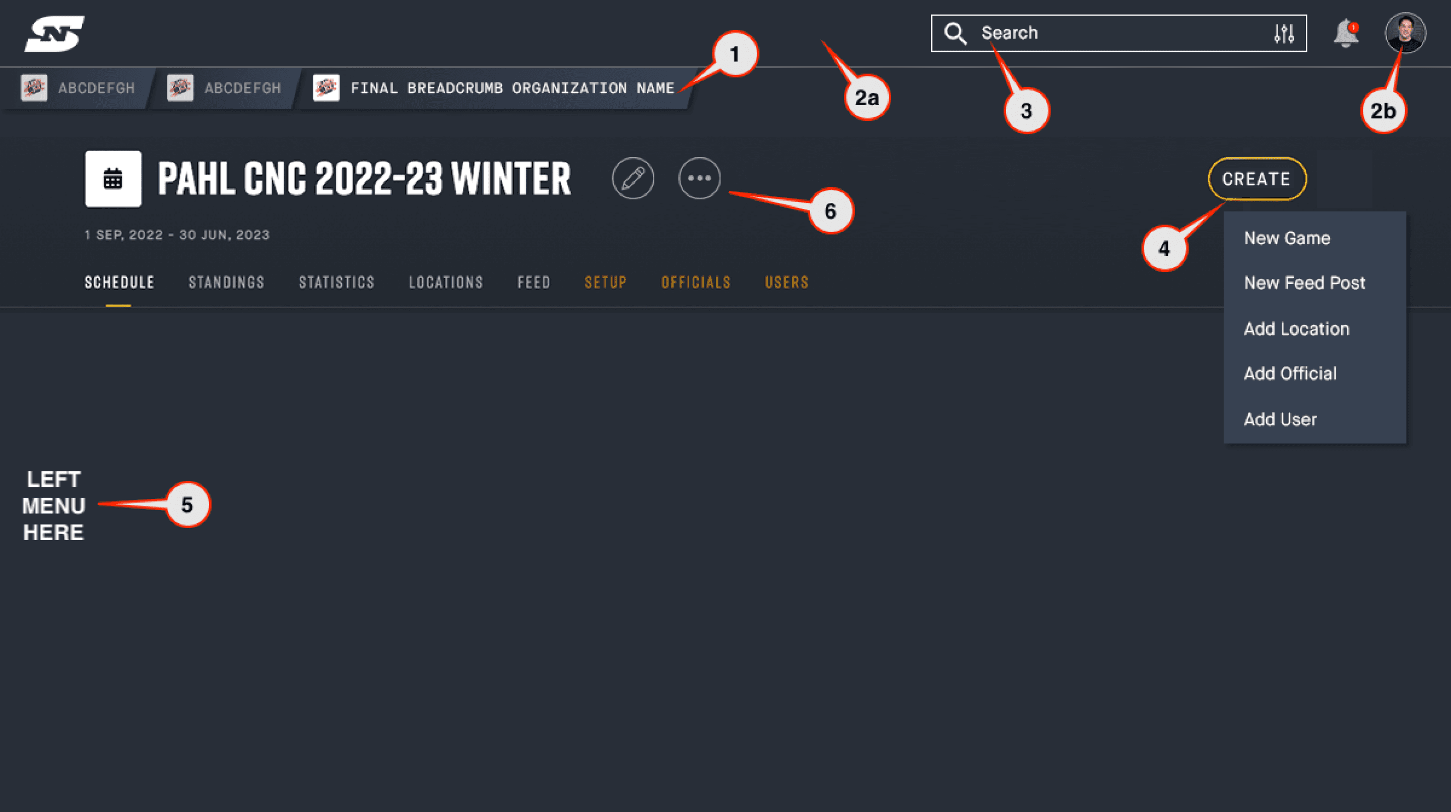
Early navigation audit, annotated against real admin tasks
Decision 1
Introduce a home feed, keep the flat structure
The first iteration added a social and activity feed as a new home destination: Home, Organizations, Competitions, Teams, Registrations. This improved content relevance, but the structure was still a flat horizontal bar with no permission logic.

V1.5, On web home turns to be the social feed


V1.5, mobile with a New Player Feature: Team Chat
Decision 2
Restructure around roles
A flat list cannot express permission hierarchy. V2 introduced three grouped sections. My Dashboard, visible to any player, covers schedule, membership, registrations, and teams. Operations, visible only to league admins and staff, covers communications, competitions, teams, and organizations. Utilities, visible to everyone, covers recents and demo leagues. A vertical sidebar was the structure that could hold this nesting.

V2, web

Sidebar also supports hierarchy navigation

Registration table, sidebar collapsed


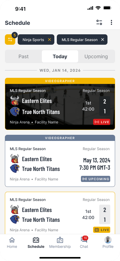
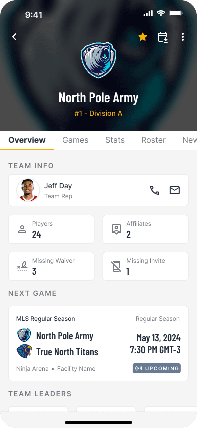


V2, mobile
Validated directionally with 10 key clients before committing engineering time. 9 of 10 preferred the new structure. The one dissenting client favored V1.5’s relative simplicity over V2’s added depth.
Decision 3
Overflow, scoped per screen
The same space constraint reappeared inside each vertical section’s own sub navigation. Items beyond the visible set collapse into a More control, scoped to whatever that specific screen needs, without disrupting the toolbar layout anywhere else in the product.

Sub navigation patterns
Decision 4
Every sport, custom experience
Expanding beyond hockey meant the scoring experience itself had to flex per sport, not just the navigation around it. Hockey, soccer, and generic sport scoring each needed different fields, different actions, and different terminology, while sharing the same underlying component structure. Building this as configurable variants of one system, rather than separate screens per sport, let new sports launch without rebuilding the scoring interface from scratch.


Hockey vs soccer vs generic scoring experience on mobile
Design system
Building the design system
Alongside the platform redesign, I led SportNinja’s full rebrand and design system, built for both web and mobile. This covered color foundations, including semantic and neutral scales, typography for headings and body text, a shared component library including buttons, forms, inputs, and tabs, elevation and blur effects, an icon set built on Material Icons, and UX writing rules for how dates and times display across the product. I used AI tools to accelerate early token and component generation, then refined, tested, and validated everything against accessibility standards, including WCAG contrast ratios, 44 by 44 pixel touch targets, and support for Cyrillic script for international clients, before anything shipped.

Design system components for web

Micro-copy rules for date, time and relative date & time
Building credibility through speed
“Right now, every feature requires custom UI work. With standardized components, we can ship 70% faster. More sales ammunition.”
As the sole designer at a fast moving startup, I had to prove design could move the business forward, not only improve the interface. I replaced assumptions with data. I audited Firebase and GA flows, launched an NPS survey with 2,500+ users, and ran interviews that exposed operational bottlenecks. When I pitched the design system to the CTO, I framed it around speed, not visual consistency. That framing accelerated engineering buy in. I set up weekly Consistency Calls and bi weekly design walkthroughs, and changed how Sales worked with design.

Weekly meeting with engineering team - UI Consistency Call
“I really like enjoy using this app. It’s easy to navigate…”
App Store review, 2024
By 2024, the conversation had changed. Reviews that once called the app unusable started asking for smaller refinements, not asking to fix the basics. One user who reported a broken sign up flow, unable to select their birth year without scrolling back decade by decade, came back days later with an updated review after the fix shipped.

What I learned
Design has to move the business
UX improvements only matter when they unlock revenue, efficiency, or retention. The design system was approved because I showed it would accelerate revenue driving features, not because it was the right thing to do on principle. Framing initiatives around measurable outcomes secured buy in faster than aesthetics did.
Small wins build the trust for bigger bets
I could have spent six months building a perfect design system. Instead I shipped quick wins within weeks to build credibility, then invested in infrastructure. That early momentum gave me the political capital for longer term bets. Without a team to manage, I still had to lead by making myself useful. Rebuilding sales decks, creating tutorial videos, and embedding in dev sprints made me a collaborator, not a gatekeeper.
If I did this again…
…I would push for the role based Operations and Dashboard split a full year earlier. We treated it as a v2 refinement, when the underlying permission logic should have shaped the IA from day one. I would also start the sport-specific scoring variants earlier in parallel with the navigation work, instead of sequencing them after. Both problems came from the same root cause, a system built around one sport's assumptions, and solving them together from the start would have saved a full redesign cycle later.