Redesigning a 12-Year-Old Insurance Dispute Platform Used by 500+ Health Institutions
Role
UX/UI Designer → Design Chapter Lead
Context
HealthTech • Enterprise SaaS
Period
2020
Responsibilities
Strategic Leadership
Established company's first UX practice; grew team from 1 to 4 designers
Designed and facilitated prioritization workshops with C-levels, devs, and support
Created Design Chapter structure, critique sessions, and quality standards
Led UX evangelization: YouTube live, internal podcast, hackathon mentor/judge
Built partnerships with Design Circuit (internships) and IPOG (education benefits)
Hands-On Execution
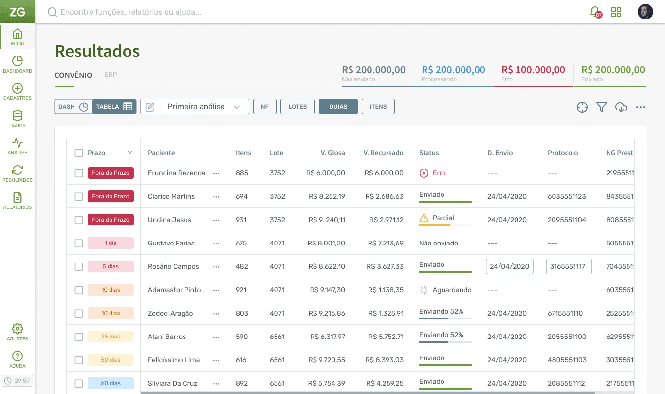
Led end-to-end redesign of ZeroGlosa 2.0, the flagship product
Conducted shadowing sessions with hospital finance teams via Google Meet
Ran A/B usability tests with 24 users via Maze
Designed wireframes (Balsamiq), prototypes (Figma), and ran tests (Marvel, Maze)
Created initial design system, style guide, and custom icon library
Impact & Key Stats
500+
Health Institutions
Across Brazil & LATAM
80%
Faster Task Completion
From ~30 min to ~5 min per workflow
29 → 75
Usability Score
Legacy vs. redesigned flow in Maze
1 → 4
Design Team Growth
Built the company’s first Design Chapter
By The Numbers
Between 2020 and 2021, I helped transform both the product experience and the company’s approach to design. What started as a solo UX role evolved into a formal Design Chapter, with embedded designers, critique sessions, research practices, and clearer quality standards.
From Avoidance to Adoption
Users who previously avoided the tool because of its complexity began using the redesigned workflow more actively. Faster processing allowed hospital finance teams to file more disputes with less effort, helping protect revenue that might otherwise be left unchallenged.
From 30 Minutes to 5 Minutes per Workflow
User testing showed an 80% reduction in task completion time, from approximately 30 minutes to 5 minutes per workflow. Smart defaults, such as reusing the previous justification for similar denial types, and color-coded status indicators helped turn repetitive work into faster, more confident actions.
This reduction suggested up to 6x higher processing capacity for analysts handling repetitive disputes. The momentum also helped justify the creation of a formal Design Chapter and a partnership with Design Circuit for junior designer internships.
A Legacy Interface Users Avoided
ZeroGlosa detects when insurers underpay hospitals and helps finance teams manage dispute workflows. But after 12 years of feature accumulation, the interface had become a barrier to recovery.
91 Actions, 70% Unused
During shadowing sessions and stakeholder workshops, I mapped 91 visible actions across the workflow. Only 14 were considered essential to the core dispute process.
The rest created friction: analysts had to scan through rarely used filters, tabs, and buttons before taking action. In some cases, teams avoided parts of the workflow altogether, leaving recoverable revenue harder to pursue.
No UX Research Culture
As the company’s first UX hire, I joined a team with no formal research practice, limited user validation, and product decisions often driven by stakeholder opinions or support tickets rather than observed user behavior.


Evangelizing Through Evidence
I couldn't mandate culture change. I had to earn credibility by making user problems visible, proving design decisions with evidence, and expanding influence through shared wins.
Made Problems Visible
I invited C-level stakeholders, developers, and support teams to observe users working through the legacy workflow. We then ran 3 prioritization workshops with 18 participants to classify actions as essential, secondary, questionable, or removable.
By making friction visible and turning feature removal into a shared decision, we eliminated 50 actions in the first round with 93% cross-group agreement.
Let Data Resolve Debates
I tied key design decisions to measurable evidence. We tested the legacy flow and two redesign variants in Maze with 24 users, comparing usability scores, task completion, and heatmaps.
The strongest redesign scored 75, compared with 67 for the alternative variant and 29 for the legacy experience. Heatmaps showing little or no interaction with supposedly “essential” features helped the team align around a simpler interface.


Simplification at Scale
The goal wasn't prettier—it was manageable complexity while preserving power for expert users.
Split Interface, Clear Status
Divided into Metrics tab (data visualization) and Execution tab (task completion). Color-coded status—pending, processing, sent—consistent across dashboard indicators and table rows. Added error column showing exactly why claims failed (e.g., "invalid batch number"). Users could scan and act in seconds.
Smart Defaults, Bulk Actions
Pattern matching from historical data: "This denial type used this justification last time. Apply same?" Group actions for bulk processing similar items. Validation through 3 shadowing sessions, wireframe testing, and 24-user Maze tests before launch.
What I Learned
Design leadership in skeptical environments requires evidence, patience, and strategic inclusion.
Culture Outlasts Deliverables
The critique sessions, embedded designers, and research practices I established continued after I left. Changing how people think about users matters more than any single redesign.
Metrics Create Permission
Without data, design is politics. With data, it's trade-off discussions. The Maze reports and workshop outcomes gave me ammunition to cut features that stakeholders loved but users ignored.
