Collaborative Leadership in Action
Building a User-Centred Culture
ZG Soluções is a leading Brazilian healthcare software company that has a flagship application called "ZeroGlosa." This platform has processed over 876 million items and recovered R$990 billion across 460 healthcare institutions.
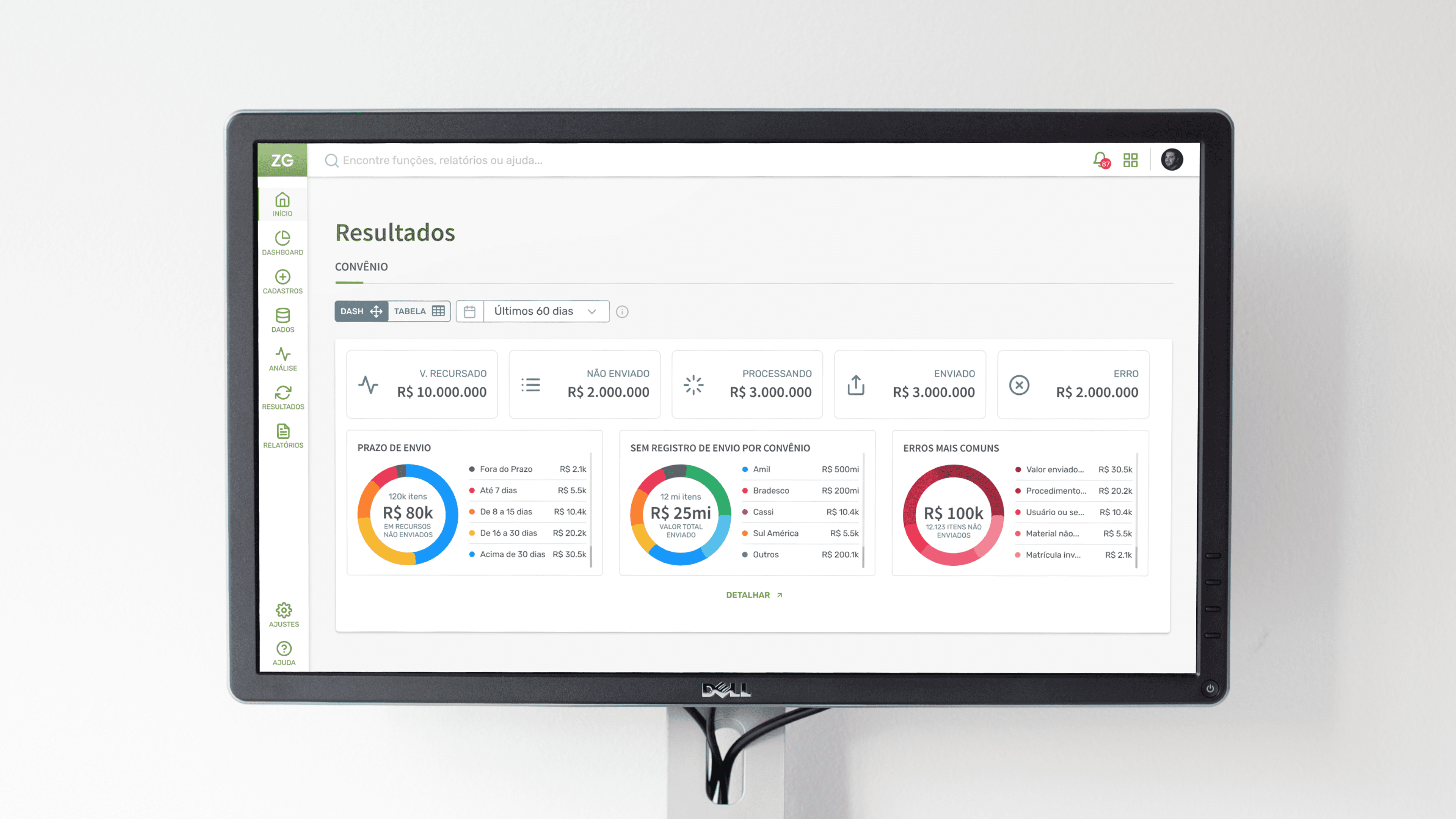
As the first in-house UI/UX designer, I played a crucial role in establishing a user-centered design approach. Through collaboration and research, I led the formation of a strong design team, prioritizing user needs and streamlining the user journey. My promotion to Leader of the Design Chapter further solidified this commitment.
Understanding User Needs
Deciphering the Complexity
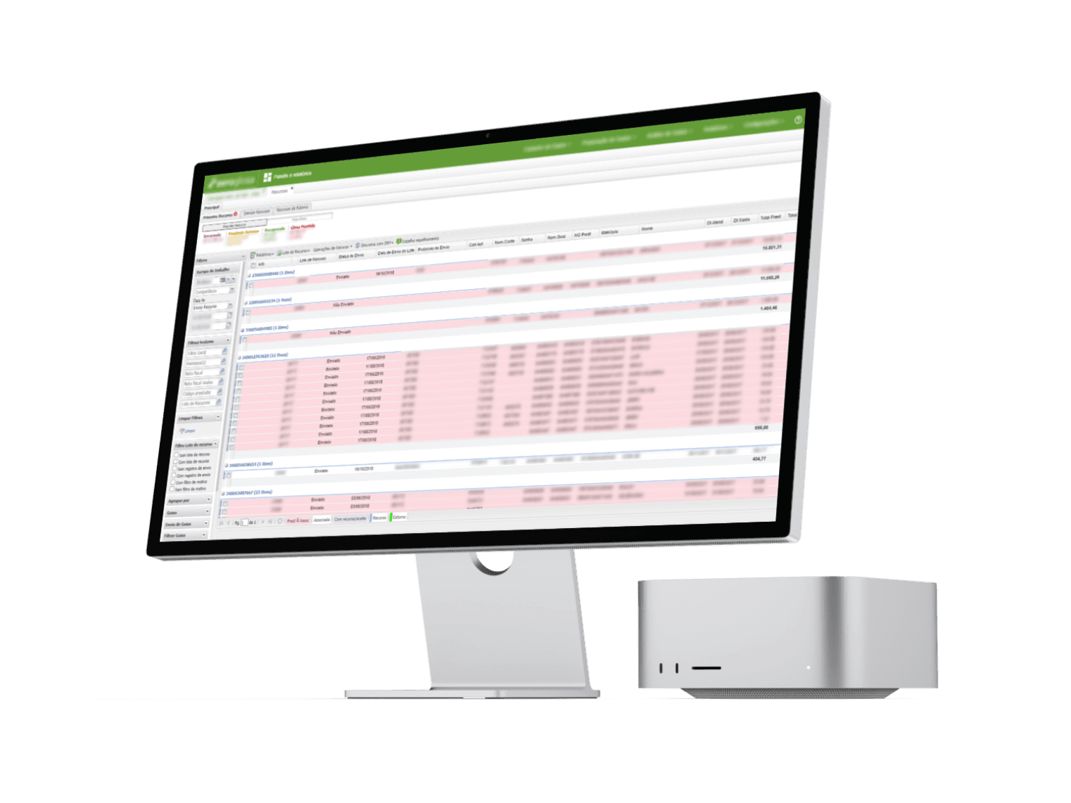
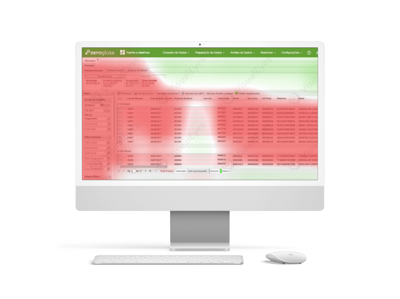
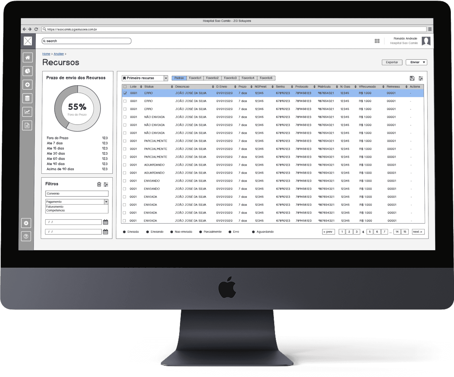
Understanding daily user interactions with the software was paramount. Through shadowing sessions with clients using Google Meet, I observed screen interactions and documented common user journeys.
As you can see in the image (left), while user attention was directed towards valuable table content, a multitude of numbers, filters, tabs, and menu options cluttered the interface. We recognized the need to simplify.
Prioritization & Collaborative Innovation
Streamlining the User Journey
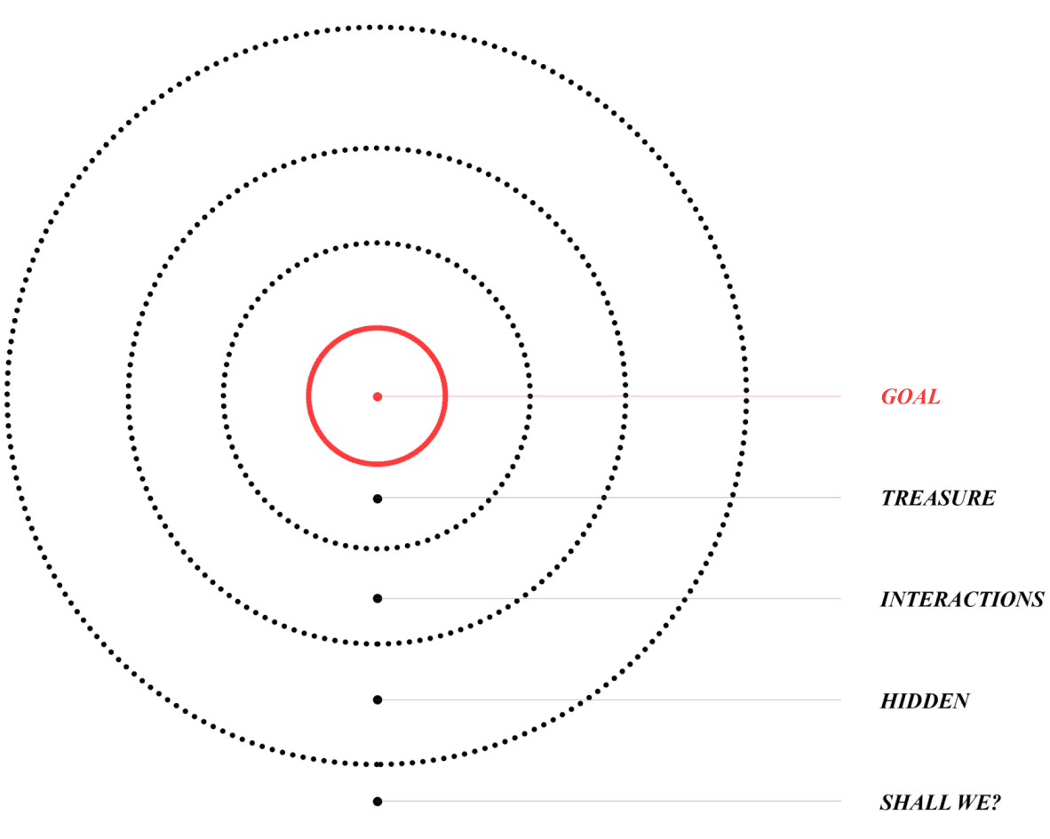
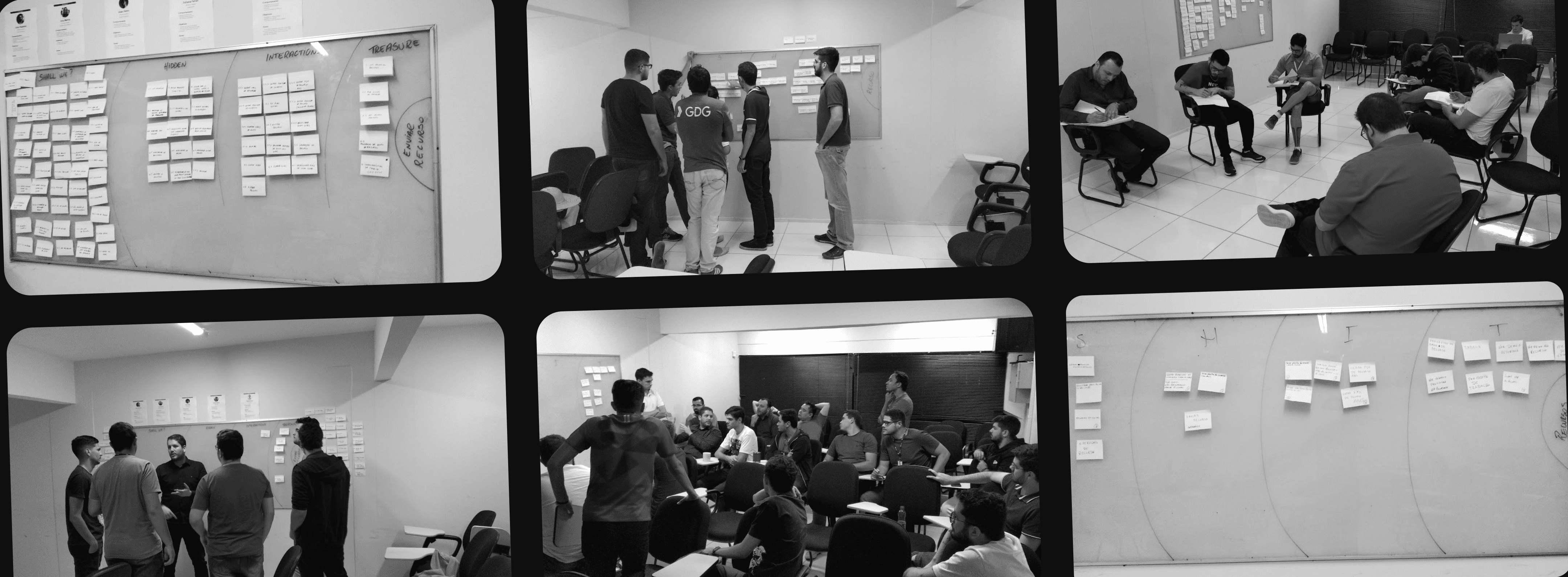
To address complexity, we implemented the S.H.I.T. methodology, prioritizing core functionalities and identifying elements as "Treasure" (essential), "Interaction" (important but can be streamlined), "Hidden" (less crucial), or "Shall we?" (questionable value). Analyzing screens, user journeys, and usage patterns, we then conducted a collaborative workshop.
This workshop brought together everyone, from C-levels to the support team, to ideate on simplifying the user experience. The initial version had 91 functionalities, with 70% unused. Through three workshop rounds, we collaboratively eliminated 50 actions in the first round, culminating in a final set of 14 essential functionalities. Fueled by this collaboration, we then embarked on a "crazy 8's" exercise, generating a multitude of ideas and propelling us towards the optimal solution.
Pen & Paper? Wireframes & Beyond
Turning Insights into Action
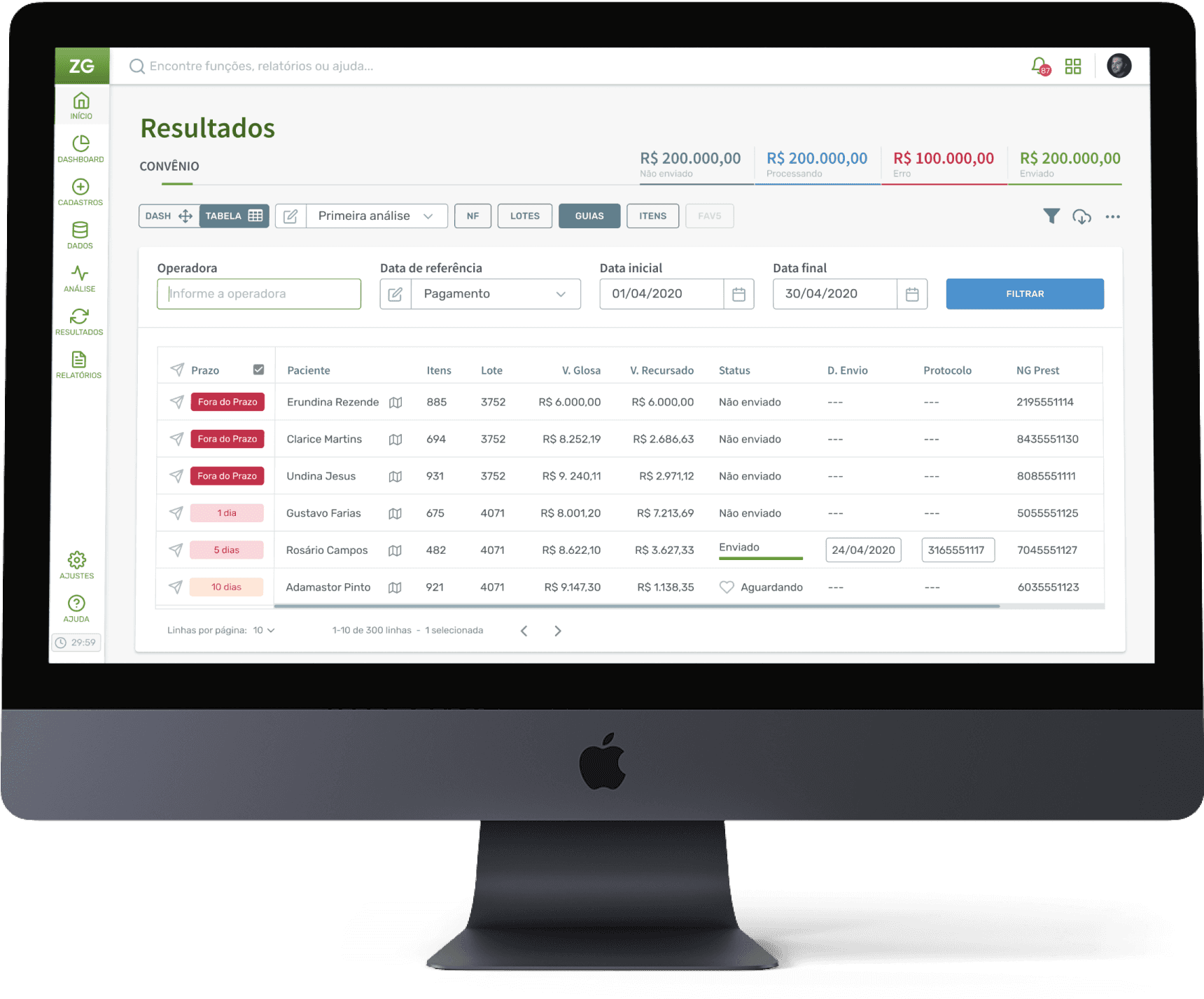
Leveraging workshop outcomes, I created an initial screen concept. After incorporating team feedback and adjustments, we conducted usability testing with intern users using Balsamiq wireframes and the Marvel app.
Based on wireframe testing and analysis, we proceeded to create a high-fidelity prototype in Figma. This involved developing an initial style guide and a custom icon font for the new interface, a collaborative effort with the design team.

Time to Run A/B Tests and User Validation
Putting the Design to the Proof
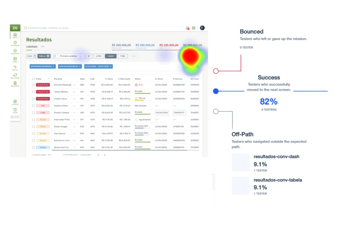
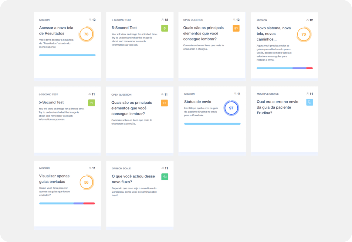
With a high-fidelity prototype in hand, we were ready to validate its effectiveness. To ensure we were offering the optimal solution, we created two design variations of the screen, each addressing slightly different approaches to user interaction. We then conducted A/B testing with a group of 24 users, carefully monitoring their behavior and gathering their feedback.
The valuable insights gained from this testing revealed areas where the design could be further simplified. For instance, user feedback highlighted specific actions that could be automated, streamlining the workflow and minimizing the number of steps required to complete tasks. By incorporating this feedback, we were able to refine the design even further, ensuring a truly user-centric experience.

Maze Test Heatmap
New Workflow Test Summary
Impact & Conclusion
Empowering Users, Enhancing Empathy
The user response to the redesigned screen was overwhelmingly positive. User testing sessions yielded feedback praising the design's clarity, ease of use, and efficiency. This project served as a powerful testament to the transformative power of user research and collaborative design. By actively involving stakeholders and exposing them to the true user experience, we fostered a heightened sense of empathy within the company. This collaborative approach led to a more successful outcome for the project and solidified a user-centred design culture within ZG Soluções.
The success of this case study underscores the importance of prioritizing user needs in healthcare software. By simplifying the interface and focusing on essential functionalities, we were able to empower users and ultimately contribute to improved healthcare efficiency. This project exemplifies the power of collaboration, highlighting how involving everyone throughout the design process can lead to groundbreaking solutions.
Time to Complete Task
80% Less
Satisfaction
83% Users
Total Money Recovered
+R$ 1 Billion

This experience reinforces my belief:
Contact
Ready to bring your vision to life or just want to chat? Reach out, and let's create something memorable together.
I'm here to listen, collaborate, and craft design solutions that resonate.
ronaldoandrad@outlook.com
